
Creditas Brutal
Breaking legacy patterns through divergent design exploration
The Challenge
Creditas had grown rapidly, accumulating products across loans, automotive, e-commerce, and HR benefits. The mobile experience had become a patchwork of incremental decisions, with navigation patterns that no longer served how users actually moved through the ecosystem.
The design team was stuck in optimization mode, making small improvements within inherited constraints. Leadership wanted something different: a deliberate break from legacy thinking to discover what the experience could become if we started from first principles.
Divergent Exploration
I led a small team in a two-week design sprint focused purely on divergence. The goal was not to ship, but to generate new directions, stress-test assumptions, and provoke internal conversation about what modern fintech navigation could look like.
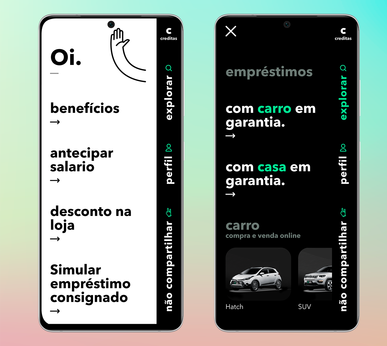
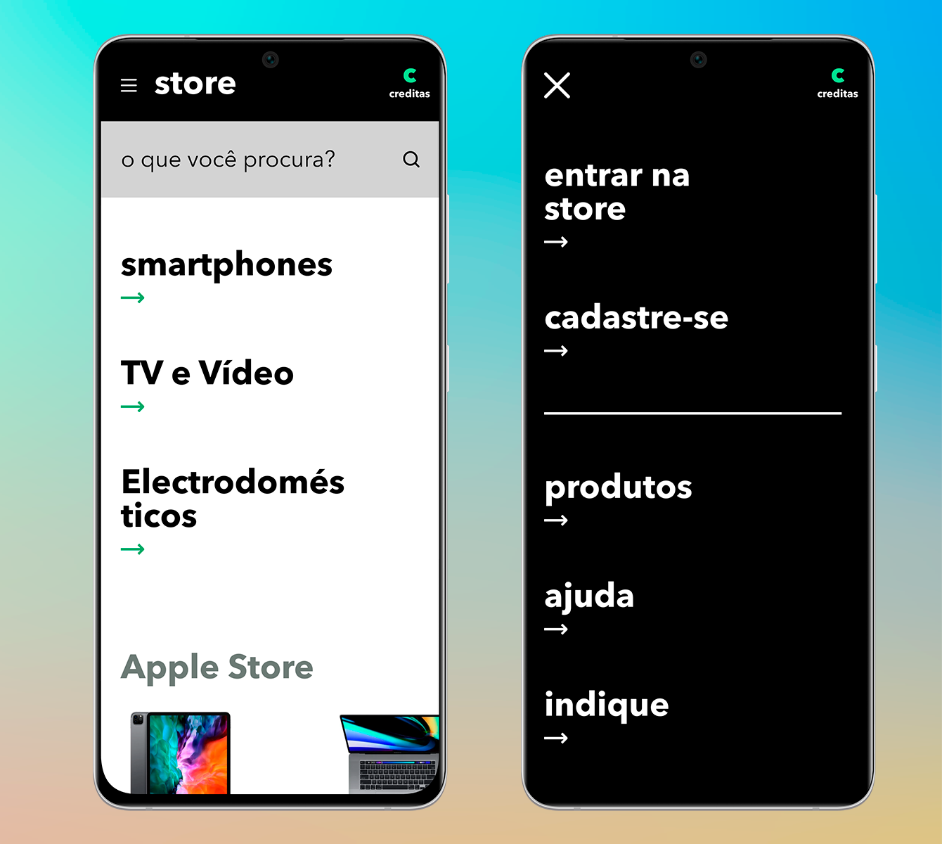
We stripped the information architecture back to user goals: access services, explore options, complete transactions. Then we rebuilt the mobile structure around those goals, experimenting with full-screen contextual menus, unified home layouts, and navigation patterns borrowed from gaming and media apps rather than traditional banking.
Design Principles
The MVP was built around three provocations. First, full-screen menus that treated navigation as content, not chrome. Users could scan the entire service landscape at a glance instead of hunting through nested hierarchies. Second, unified entry points that collapsed the distinction between financial products and marketplace offerings into a single coherent home. Third, visual density that packed more information into each screen without sacrificing scanability, trusting users to handle complexity when it served their goals.
We prototyped in high fidelity to test emotional response alongside usability. The brutalist visual language was intentional: it signaled that this was a departure, not a polish pass.
Impact
The MVP was never intended for production, but it achieved its strategic purpose. Internal stakeholder reviews surfaced strong opinions about navigation philosophy, visual identity, and information density. The prototype became a reference point in subsequent design discussions, influencing decisions on the production roadmap even when specific solutions were not adopted directly.
Three patterns from Brutal made it into later releases: the unified home concept, the full-screen explore pattern, and the denser card layouts. More importantly, the sprint established a precedent for divergent exploration as a legitimate design practice at Creditas, creating space for the team to challenge inherited assumptions rather than only optimize within them.